library(tidyverse) # {dplyr}, {ggplot2}, {readxl}, {stringr}, {tidyr}, etc.Exercise 1: Anscombe’s quartet
Session 5
Download datasets on your computer
Load data and install useful packages
repository <- "data"# read Anscombe's quartet data
anscombe <- readr::read_tsv(paste0(repository, "/anscombe.tsv"))Rows: 44 Columns: 3
── Column specification ────────────────────────────────────────────────────────
Delimiter: "\t"
dbl (3): set, x, y
ℹ Use `spec()` to retrieve the full column specification for this data.
ℹ Specify the column types or set `show_col_types = FALSE` to quiet this message.glimpse(anscombe)Rows: 44
Columns: 3
$ set <dbl> 1, 1, 1, 1, 1, 1, 1, 1, 1, 1, 1, 2, 2, 2, 2, 2, 2, 2, 2, 2, 2, 2, …
$ x <dbl> 10, 8, 13, 9, 11, 14, 6, 4, 12, 7, 5, 10, 8, 13, 9, 11, 14, 6, 4, …
$ y <dbl> 8.04, 6.95, 7.58, 8.81, 8.33, 9.96, 7.24, 4.26, 10.84, 4.82, 5.68,…Note how X and Y are similar!
anscombe %>%
  group_by(set) %>%
  summarise(
    mu_x = mean(x),
    var_x = var(x),
    mu_x = mean(y),
    var_x = var(y)
  )
# A tibble: 4 × 3
set mu_x var_x
<dbl> <dbl> <dbl>
1 1 7.50 4.13
2 2 7.50 4.13
3 3 7.5 4.12
4 4 7.50 4.12Note how X and Y are different!
ggplot(anscombe, aes(x, y)) +
  geom_point() +
  facet_wrap(~ set)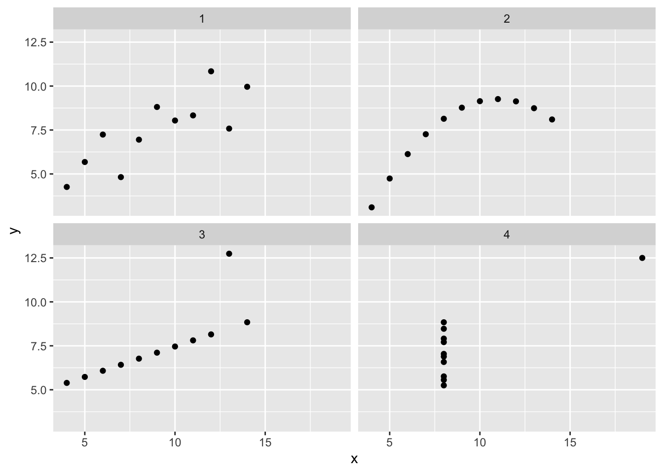
Fundamentals of the ggplot2 plotting system
R has ‘base graphics’…
plot(density(anscombe$x))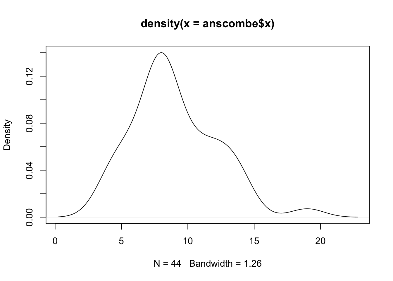
But ggplot2 just looks better!
ggplot(anscombe, aes(x)) +
  geom_density()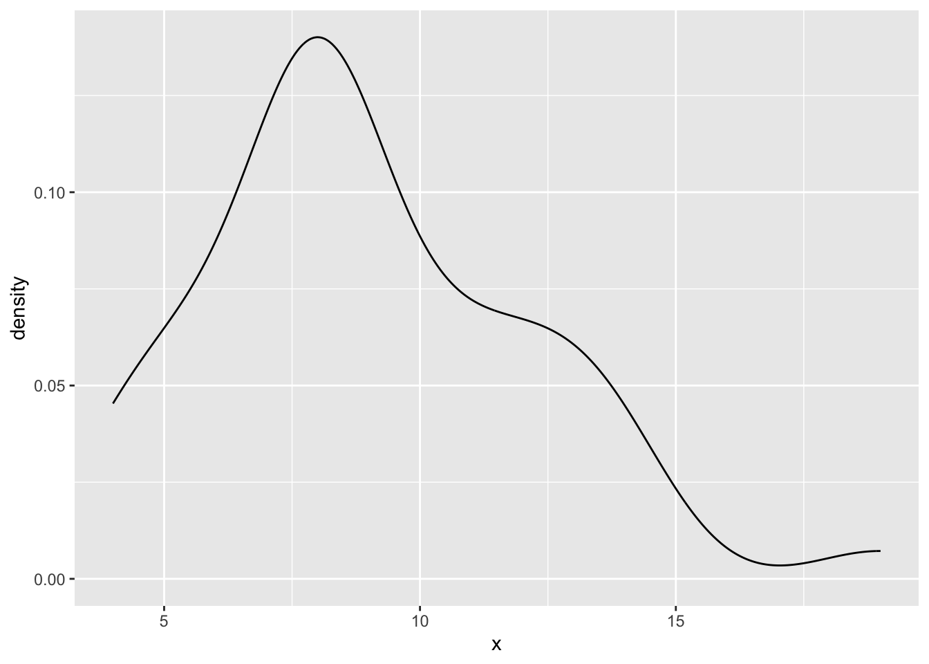
‘Base graphics’ will get you everywhere…
plot(anscombe$x, anscombe$y)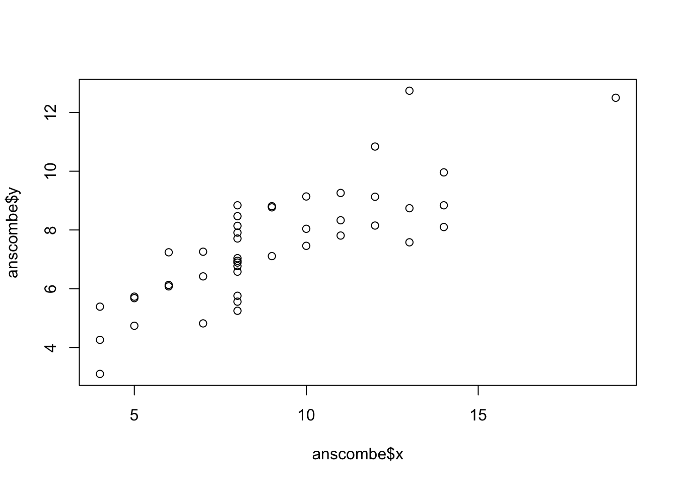
… but ggplot2 has a consistent syntax!
ggplot(anscombe, aes(x, y)) +
  geom_point()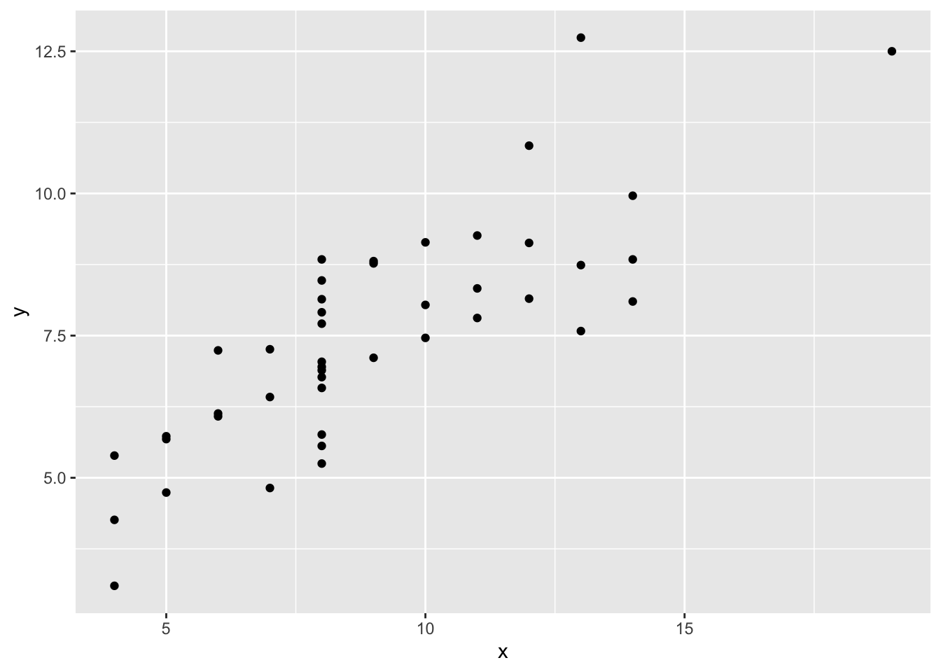
ggplot2 can modify the ‘appearance’ of your data points…
ggplot(anscombe, aes(x, y)) +
  geom_point(size = 5, color = "tomato", fill = "gold", shape = 21)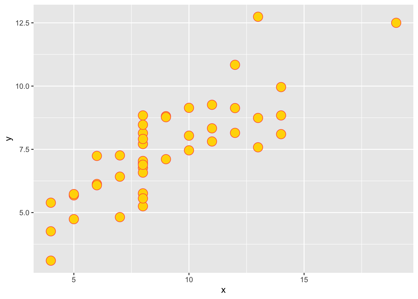
Clue
What is the type of the variable set? Use str(dataset$variable).
Solution
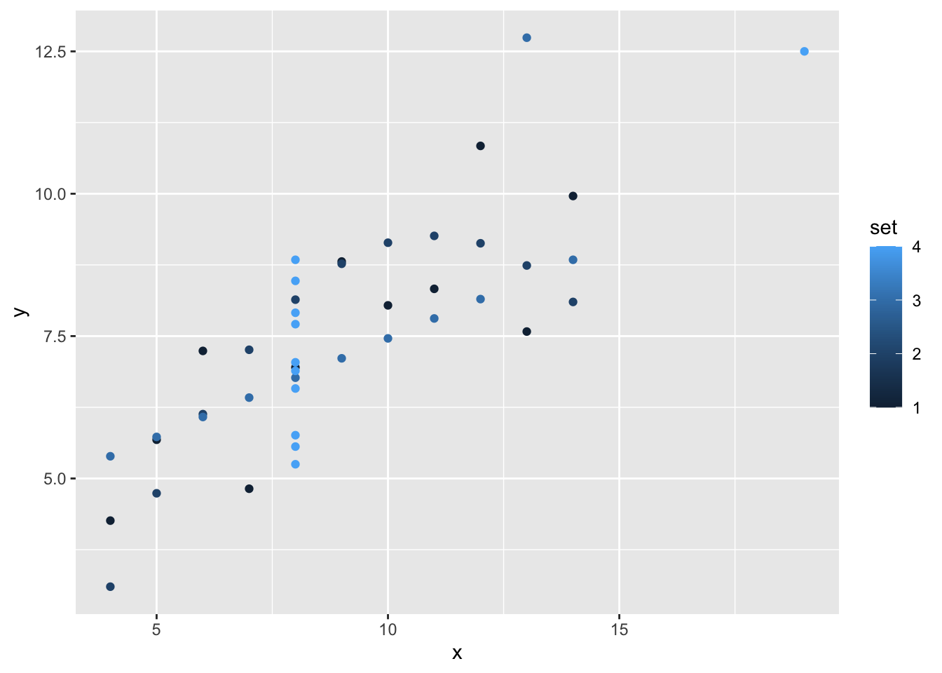
str(anscombe$set) num [1:44] 1 1 1 1 1 1 1 1 1 1 ...set is considered as a numerical variable, we prefere it to be a factor:
ggplot(anscombe, aes(x, y, color = factor(set))) +
  geom_point()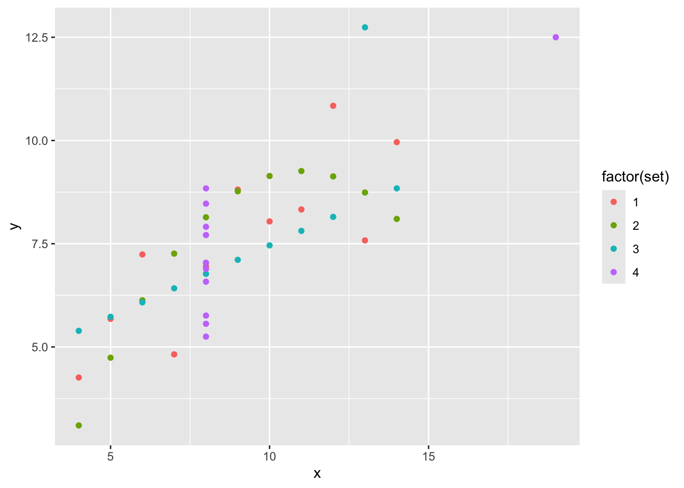
Let’s go use facets (small multiples).
ggplot(anscombe, aes(x, y)) +
  geom_point() +
  facet_wrap(~ set, nrow = 1) +
  coord_equal()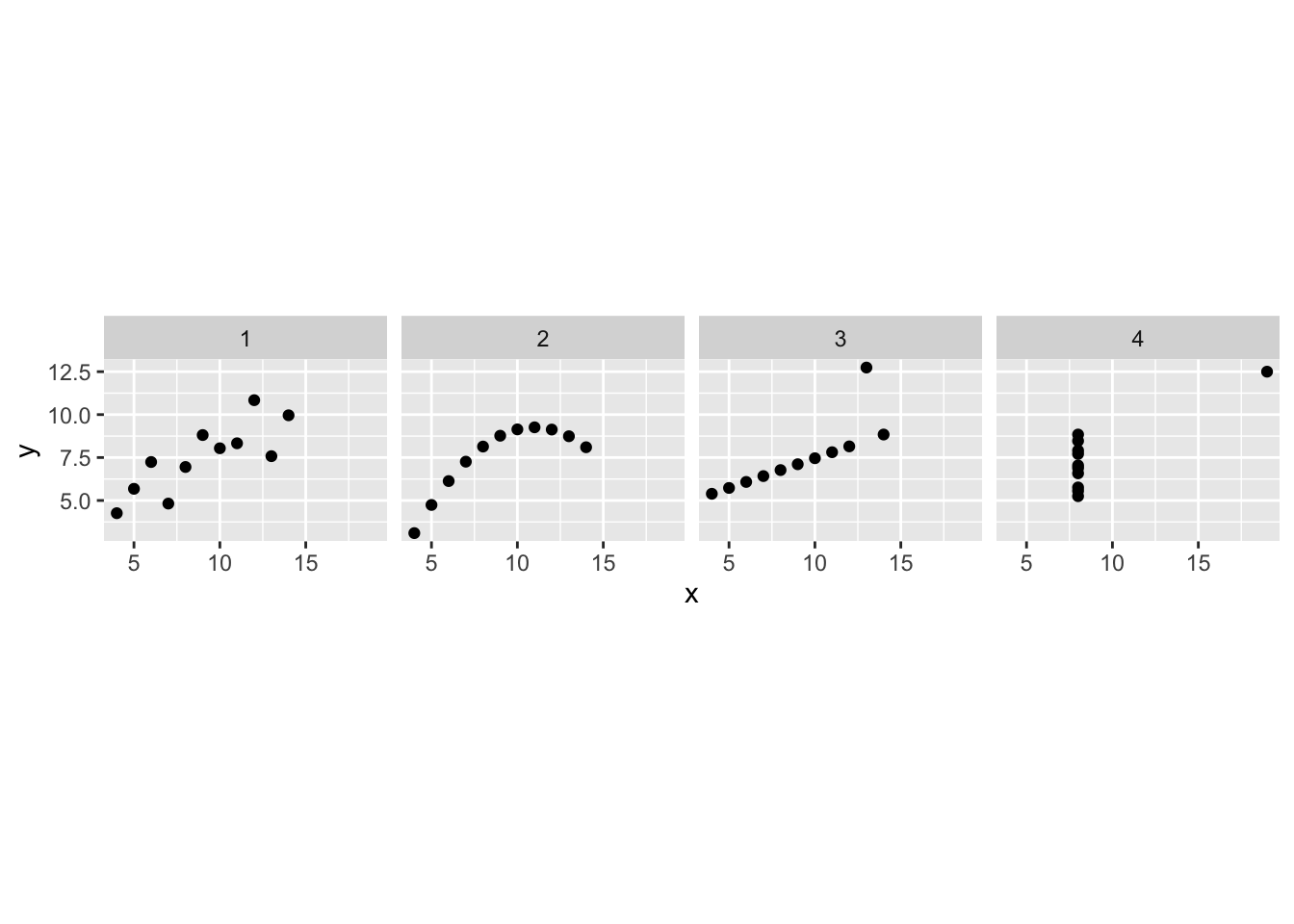
And let’s finally add another geometry.
ggplot(anscombe, aes(x, y)) +
  geom_point() +
  geom_smooth(method = "lm", fill = NA, fullrange = TRUE) +
  facet_wrap(~ set)
`geom_smooth()` using formula = 'y ~ x'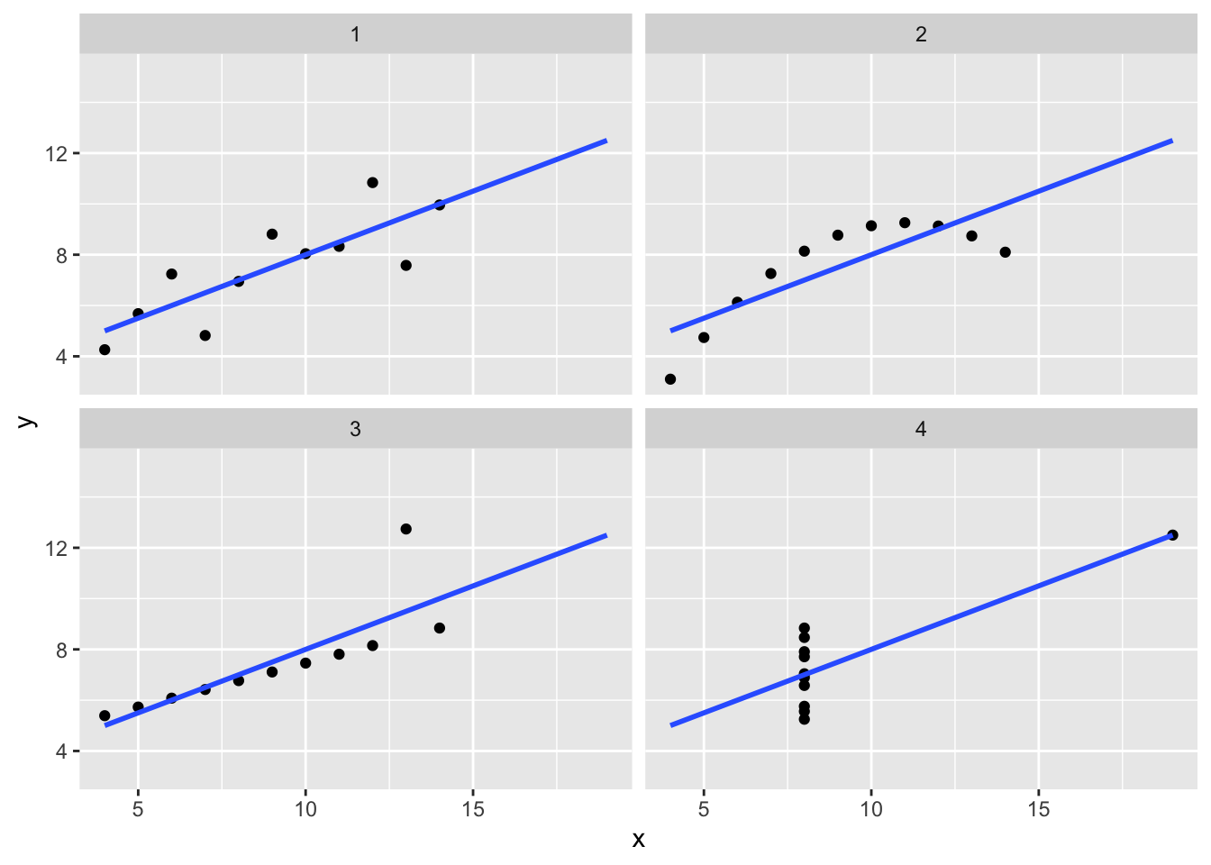
Solution
The lines are removed.
ggplot(anscombe, aes(x, y)) +
  geom_point() +
  #geom_smooth(method = "lm", fill = NA, fullrange = TRUE) +
  facet_wrap(~ set)
Source
Data source
datasets::anscombe (R package by the R Core Team), which cites Tufte (1989) as its source, and Anscombe (1973) as the initial source:
Tufte, Edward R. (1989). The Visual Display of Quantitative Information, Graphics Press, pp. 13–14.
Anscombe, Francis J. (1973). Graphs in statistical analysis. The American Statistician, 27, 17–21. doi:10.2307/2682899.
The R code to produce the ‘tidy’ version of the dataset was not preserved, but probably looked somewhat like this:
library(tidyverse)
datasets::anscombe %>%
  tidyr::pivot_longer(everything()) %>%
  mutate(coord = str_sub(name, 1, 1), set = str_sub(name, 2, 2)) %>%
  select(-name, set, coord, value) %>%
  tidyr::pivot_wider(names_from = "coord", values_from = "value") %>%
  tidyr::unnest(everything()) %>%
  readr::write_tsv("data/anscombe.tsv")
Rationale
The point of this demo is to show you the existence of different plotting systems in R. We cover only the ggplot2 one in class, called so in reference to the ‘grammar of graphics’ logic that it follows, but there are at least two other systems:
You’ll be fine learning just the ggplot2 one, which has also been ported to the Python language.