library(tidyverse) # {dplyr}, {ggplot2}, {readxl}, {stringr}, {tidyr}, etc.Preparation: Code and data essentials [2/2]
For Session 5
This exercise focuses on
- using RStudio to set up a project (code and data)
- code essentials: creating a script, loading required packages
- data essentials: creating data frames from external data sources
- data cleaning and preparation
This is not an easy exercise: work with your group, and get ready to spend a couple of hours on it.
Prerequisites
Prior to completing the following exercise, open RStudio and set the folder of your choice as the working directory.
Also check that you have installed the packages used in previous classes, as they will probably come in handy.
Do not forget to load them at the beginning of your script if you use their functions.
Do not forget to comment your code appropriately.
Scenario
You are interning at the Brussels office of Human Rights Watch, and have been asked to verify whether some form of disaffection with democracy shows up in Eurobarometer survey data for Poland and Hungary.
Instructions
Note – the hints below cite some R help pages, but you can also browse those pages online, by going, for instance, to the dplyr website. You should also feel free to find solutions online: use your best search skills.
Exercise
Use the previous tidy dataset from the Eurobarometer trend line for ‘satisfaction with democracy in your country’ you obtained after question 4 of last week.
Don’t forget to load the packages:
You can load the dataset from last week if you succeeded in all question 1 to 4.
OR
You can download and load the dataset eb.RDS which is the result of what you get after question 4.
repository <- "data"eb <- readRDS(paste0(repository,"/eb.RDS"))
Clue
Use the function stringr::str_extract.
This is hard, because you have to use a regular expression. Here’s the hardest part: \\d{4} will match any 4-digit number.
Solution
That column/variable is called year, but it currently contains more information than just the year:
head(eb$year)[1] "Sept.-Oct. 2007 (ST68)" "May 2010 (ST73)" "November 2011 (ST76)"
[4] "June 2013 (EB79.5)" "November 2013 (ST80)" "May-June 2014 (ST81)" Let’s get rid of that by extracting just the year
head(str_extract(eb$year, "\\d{4}"))[1] "2007" "2010" "2011" "2013" "2013" "2014"The function above looks for the first 4-digit number in each of the values of the eb$year column, and returns just that; you can use that function within a ‘pipe’ chain of functions, by enclosing it inside a call to the mutate function:
eb <- eb %>%
  # reduce `year` column to just the year
  mutate(year = str_extract(year, "\\d{4}"))
Clue
?dplyr::group_by and ?dplyr::summarise.
Solution
If you check the data, you’ll realise that there are multiple not_satisfied values for some years, because the data are made from survey measures, and multiple surveys were conducted in some years (e.g. 2013 below):
eb# A tibble: 48 × 3
country year not_satisfied
<chr> <chr> <dbl>
1 EU 2007 0.39
2 EU 2010 0.44
3 EU 2011 0.46
4 EU 2013 0.46
5 EU 2013 0.52
6 EU 2014 0.48
7 EU 2017 0.44
8 EU 2018 0.42
9 EU 2018 0.39
10 EU 2019 0.39
# ℹ 38 more rows… so since we want to have only one not_satisfied measure per year and ‘country’ (EU, HU or PL), we are going to ‘group’ the data by country-year, and then compute the average at that level:
eb %>%
  group_by(country, year) %>%
  summarise(
    n_measures = n(),
    not_satisfied = mean(not_satisfied)
  )
`summarise()` has grouped output by 'country'. You can override using the
`.groups` argument.# A tibble: 33 × 4
# Groups: country [3]
country year n_measures not_satisfied
<chr> <chr> <int> <dbl>
1 EU 2007 1 0.39
2 EU 2010 1 0.44
3 EU 2011 1 0.46
4 EU 2013 2 0.49
5 EU 2014 1 0.48
6 EU 2017 1 0.44
7 EU 2018 2 0.405
8 EU 2019 2 0.405
9 EU 2020 1 0.41
10 EU 2021 3 0.413
# ℹ 23 more rowsIn the code above, we have added a n_measures variable that shows you how many measures were present for each country-year (e.g. 2013, again)
You might ask but aren’t we kinda losing some information by aggregating the data as we do? The answer is yes: taking the mean of each country-year is a lossy operation, but since our final product will be a line plot showing the not_satisfied variable through time, it is reasonable to take that step in order to reduce the amount of information in the plot
As an exercise, you can try plotting the data without taking that step:
eb <- eb %>%
  group_by(country, year) %>%
  summarise(not_satisfied = mean(not_satisfied))
`summarise()` has grouped output by 'country'. You can override using the
`.groups` argument.
Clue
?dplyr::arrange.
Solution
eb %>% arrange(year, country)
Question 8
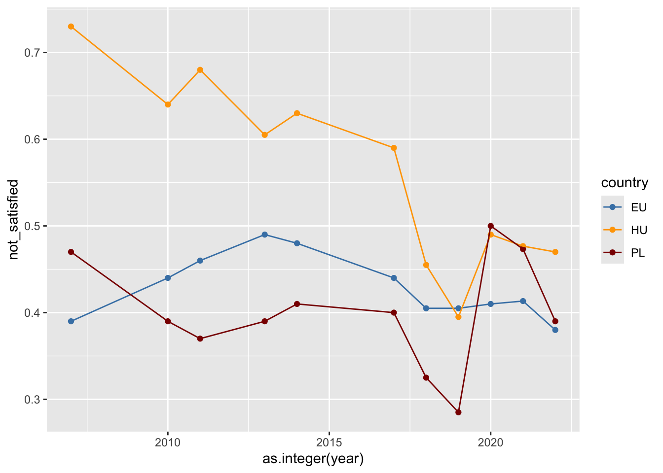
You can now plot the data as below:
Clue
I’m once again giving the code here, but you will have to find a way to make it work with your own code.
   ggplot(your_dataset) +
   aes(x = as.integer(year), y = not_satisfied, color = country)) +
     geom_point() +
     geom_line(aes(group = country)) +
     scale_color_manual(
       values = c(
         "EU" = "steelblue",
         "PL" = "darkred",
         "HU" = "orange"
       )
     )
Solution
Here is a point-and-line plot.
ggplot(eb, aes(x = as.integer(year), y = not_satisfied, color = country)) +
  geom_point() +
  geom_line(aes(group = country)) +
  scale_color_manual(
    values = c(
      "EU" = "steelblue",
      "PL" = "darkred",
      "HU" = "orange"
    )
  )
We will have some time in later sessions to discuss the plot syntax, which uses the {ggplot2} package.
… as for the rest of the script above, a shorter version is available in this folder, with less explanations, and with all operations ‘piped’ with one another, for compactness.
At that stage, you might be thinking that you could have done the same thing in another software, possibly even a spreadsheet editor – but you have to take into account the fact that the steps above are now fully documented and reproducible, and that they could have included more complex operations that you would have struggled to perform ‘by hand’ in your favourite spreadsheet editor, with an additional risk of error.
If you got there: well done! If not: try harder, and do not get discouraged – data preparation is the hardest part :)