library(tidyverse) # {dplyr}, {ggplot2}, {readxl}, {stringr}, {tidyr}, etc.Preparation: Datavisualization with Preston Curve
For Session 7
This exercise focuses on
- making use of code that was distributed to you earlier
- exploring the many options of the
ggplot2package - finding help online when required
This is not an easy exercise: work with your group, and get ready to spend a couple of hours on it.
Scenario
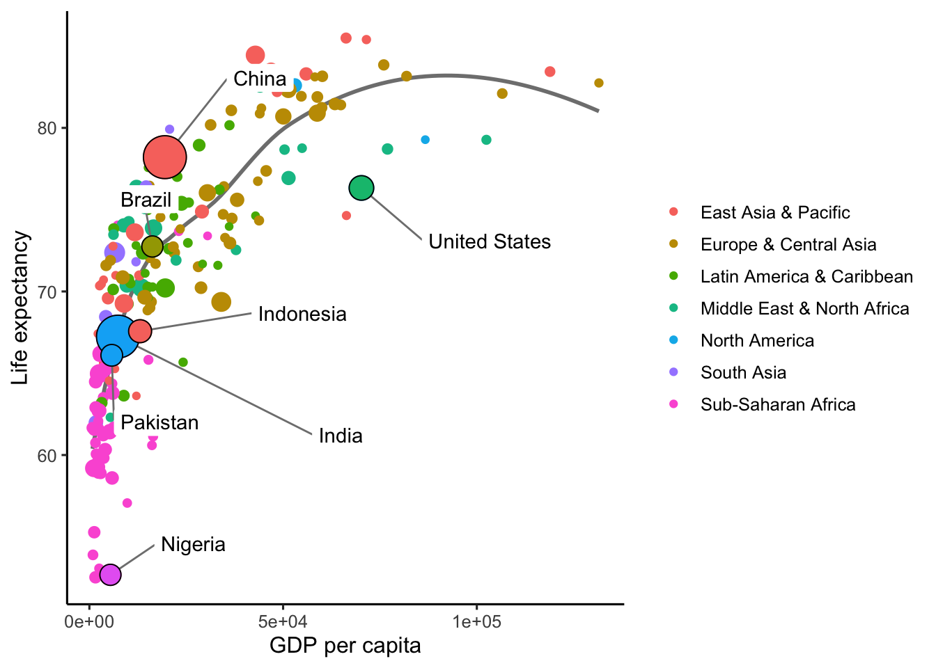
You are interning at the World Bank, and have been asked to plot the most recent version of the Preston curve.
A previous intern has left you some code, which is included in this folder, as well as a plot showing the expected result. However, the code to reproduce the plot, which is also reproduced below, is actually missing from the script.
Instructions
Execute and fill in the script to get as close as possible to the expected result.
Hints:
- Everything except the text labels happens with the
ggplot2package. Check its online documentation as much as needed. - The text labels are the hard part to get. They are produced by using the
ggrepelpackage: read its vignette, and see if you can manage something close enough to the expected result. - The expected result uses the ‘classic’
ggplot2theme (?theme_classic), with a base text size of12points. - The size of the data points in the expected result range from
1.5to10.5. Usescale_size_continuousto specify that range.
Download dataset on your computer
Load data and install useful packages
library(countrycode)repository <- "data"# read the 'wdi' dataset
wdi <- readr::read_csv(paste0(repository, "/wdi.csv"), show_col_types = FALSE)Exercise
Exercise
Draw this curve!
Clue
You will need 2 steps.
Step 1: Preprocessing
- Using the
countrycodepackage, recode the variableiso3cfromiso3cformat toiso3cformat. This step putsNAfor non-country ISO-3C. - Create a new variable called
regionthat transforms the sameiso3cvariable fromiso3ctoregionformat - remove
NA - take the latest (
max) date grouping byiso3c
Step 2: Draw the graph
Of course, you’ll use ggplot2 package and more precisely:
geom_smoothgeom_point(twice!).
Note : Look how some circles are labelled and circled in black. It concerns countries for which pop > 200 * 10^6. You may need to filter the dataset at some point!
ggrepel::geom_label_repellabsand to modify the axes
You can work on the theme with the following code:
# control the minimal and maximal point sizes
scale_size_continuous(range = c(1.5, 10.5)) +
guides(fill = "none", size = "none") +
# final cosmetics
  theme_classic(base_size = 12) +
  theme(legend.position = c(0.87, 0.25),
        legend.title = element_blank())
Solution
Step 1: Preprocessing
wdi <- wdi %>%
  mutate(
    # remove non-country ISO-3C does
    iso3c = countrycode::countrycode(iso3c, "iso3c", "iso3c"),
    region = countrycode::countrycode(iso3c, "iso3c", "region")
  ) %>%
  # drop rows with missing values
  tidyr::drop_na() %>%
  # subset to most recent year
  group_by(iso3c) %>%
  filter(year == max(year)) %>%
  as_tibble()
Step 2: Draw the graph
ggplot(wdi, aes(y = lexp, x = gdpc)) +
  # draw the Preston curve
  geom_smooth(se = FALSE, method = "loess", color = "grey50") +
  # draw the underlying data points
  geom_point(aes(size = pop, color = region)) +
  # highlight a few very populous countries
  ggrepel::geom_label_repel(
    data = filter(wdi, pop > 200 * 10^6),
    aes(label = country),
    box.padding = 1.75, segment.color = "grey50", fill = "white", label.size = 0, seed = 42) +
  # redraw the highlighted points, with an additional border
  geom_point(data = filter(wdi, pop > 200 * 10^6),
             aes(size = pop, fill = region),
             shape = 21, color = "black") +
  # control the minimal and maximal point sizes
  scale_size_continuous(range = c(1.5, 10.5)) +
  # final cosmetics
  guides(fill = "none", size = "none") +
  theme_classic(base_size = 12) +
  # bug CI
  #theme(legend.position.inside = c(0.87, 0.25), legend.title = element_blank()) +
  theme(legend.title = element_blank()) +
  labs(y = "Life expectancy", x = "GDP per capita")

# export final result
# ggsave("preston-curve.png", width = 9, height = 6)
Side note
The graph above shows the outlier status of the United States as a country, but even at the individual level, the life expectancy of US residents is starkingly lower than it should be (given US income levels).
John Burn-Murdoch, from the Financial Times, has an article and a well-illustrated Twitter thread on the topic. Quoting from it:
“Beyond age 70, US mortality/survival rates are very similar to other rich countries. But between teenage years and early middle age there is a vast gulf… More years of American lives were erased by drugs, guns & road deaths in 2021 alone than from Covid during the whole pandemic.”
I recommend taking a look at the whole thing.
Source
The data is obtained using the WDI package, using the code below:
library(WDI)
what <- c(
  "lexp" = "SP.DYN.LE00.IN",
  "gdpc" = "NY.GDP.PCAP.PP.CD",
  "pop" = "SP.POP.TOTL"
)
wdi <- WDI::WDI(indicator = what, start = 2019)
write.csv(wdi, "wdi.csv", row.names = FALSE)