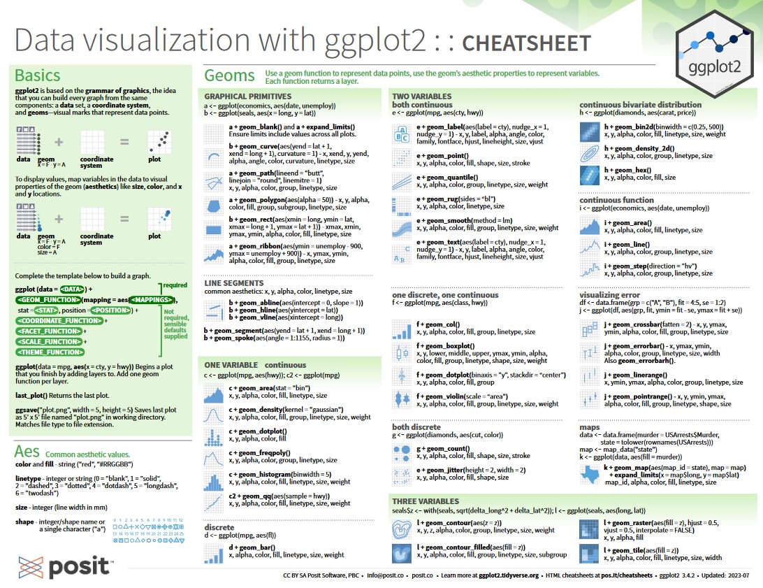
Datavisualization
Session 5
2024-03-05
One of the steps in DataScience
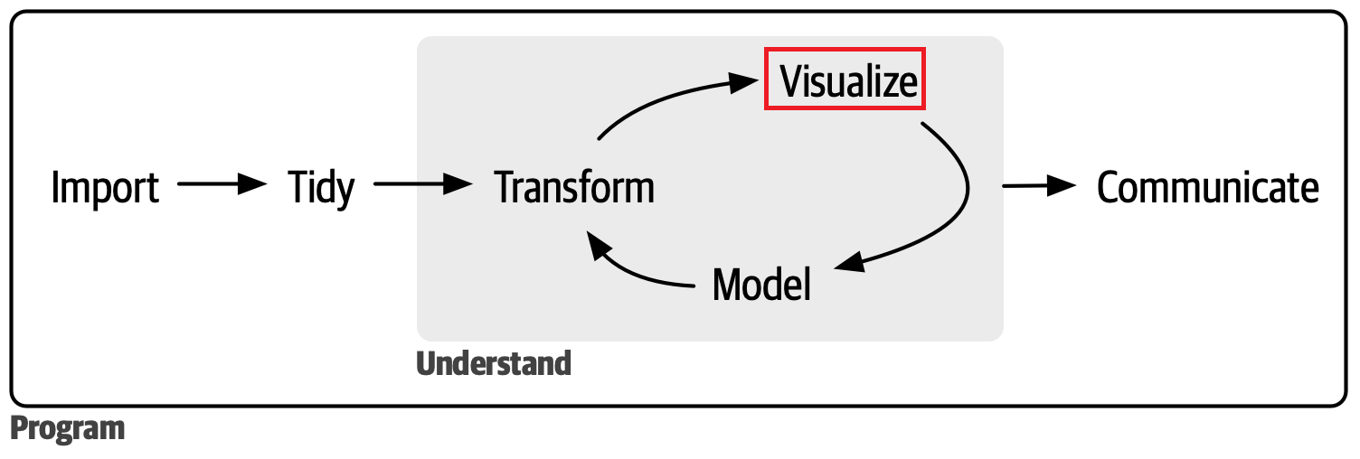
Visualization is one of the key steps in Data Science. Use visualizations to uncover unexpected patterns, prompt new questions, and gain insights. However, visualizations may be limited by human interpretation.
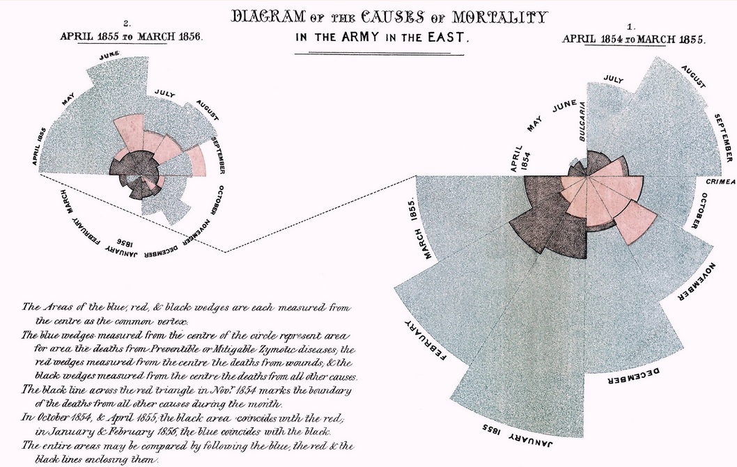
Example 1 : Circular histogram to illustrate the seasonal sources of soldiers’ fatalities during the Crimean War
Her diagram depicted twelve spokes, one for each month of the year. Each spoke was split into color-coded wedges which represented different causes of death. The blue wedges—clearly the largest—represented deaths from infectious but preventable diseases. The much smaller red wedges represented death from wounds, while the tiny black wedges death from “all other causes.
The diagram provided a compelling and immediately understandable illustration of a startling statistic: out of the 18,000 soldiers who had died, 16,000 had died of disease in hospital, rather than their wounds. Nightingale made extensive use of such diagrams in presenting reports on medical care throughout the war, and was able to persuade Queen Victoria and Members of Parliament to improve conditions in military hospitals.
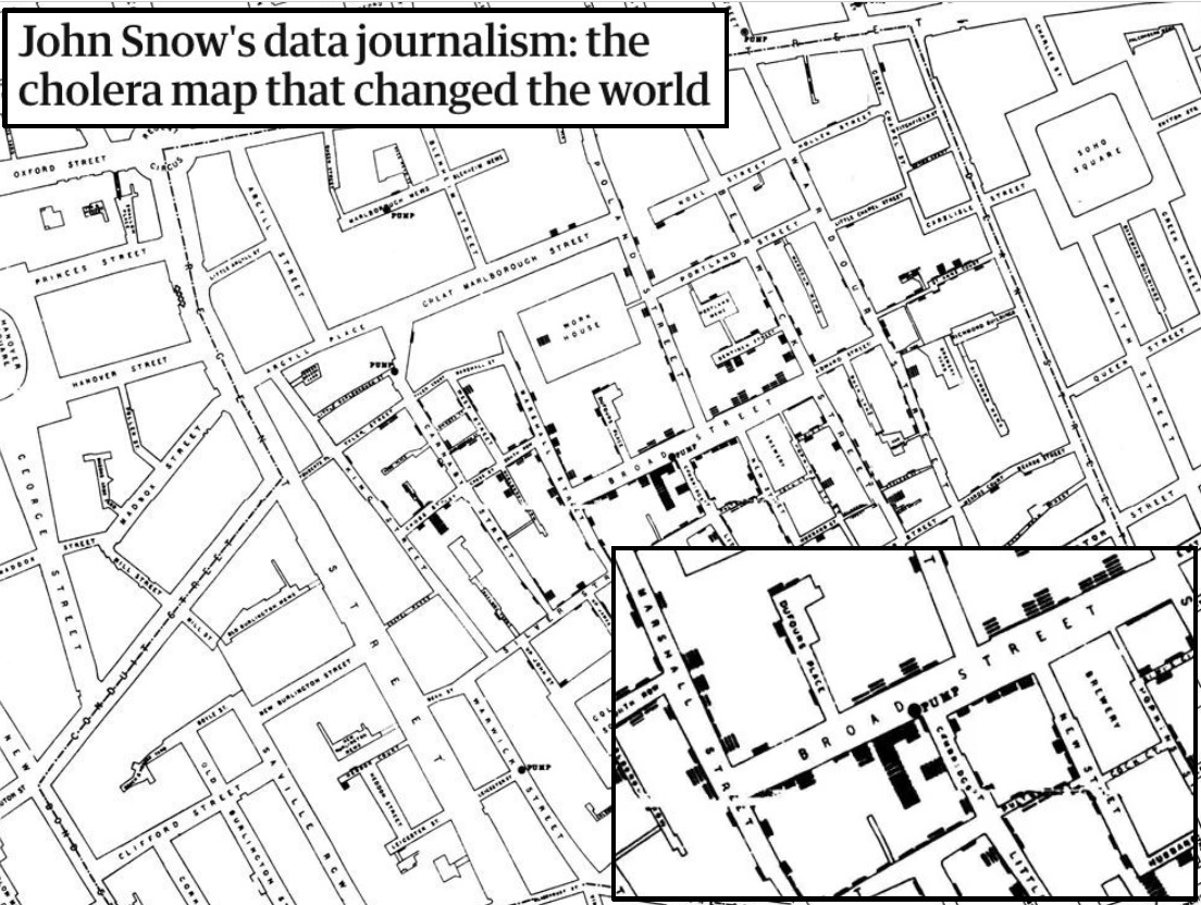
Example 2: A map tracing the source of a 1854 cholera outbreak in the Soho district of London
The prevailing belief at the time was that cholera and other diseases were transmitted by bad air. But by collecting the locations of cholera deaths, Snow was able to identify a clear concentration around the water pump on Broad Street. His research was persuasive enough to persuade the local city council to disable the well pump by removing its handle. This action has been commonly credited as ending the outbreak.
Snow used his map to convince local authorities to remove the handle of the Broad Street pump. Though the cholera epidemic was already on the wane when he did so, it is possible that the disabling of the pump prevented many deaths from future waves of the disease.
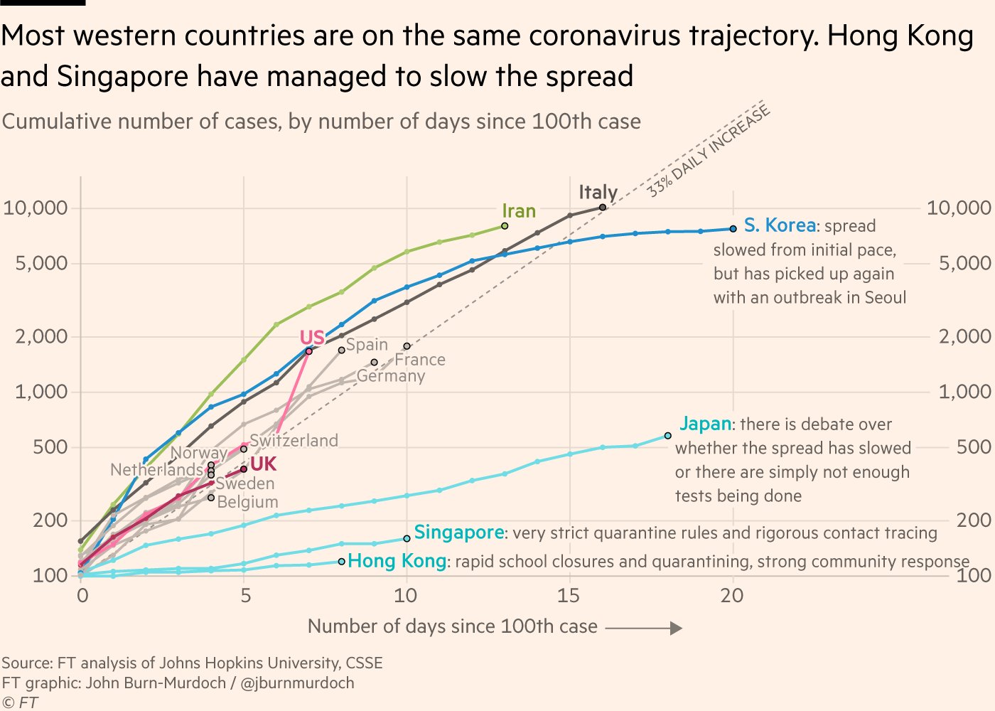
Example 3: A lineplot tracing the evolution of coronavirus spread in march 2020 in different coutries
Many western countries may soon face Italy’s situation
“Case numbers since outbreaks began in several countries have tracked a ~33% daily rise. This is as true for UK, France, Germany as Italy; the latter is simply further down the path.”
You can lean more about it in this video.
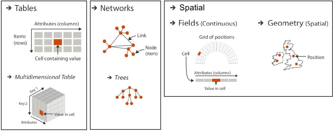
Three major datatypes
There are many data structures used in various fields. It includes database management, network analysis, and spatial data analysis:
Tables: One of the most common and straightforward data structures. They consist of attributes (columns) and items (rows), where each cell contains a value. (relational databases, spreadsheet software…)
Networks: They represent relationships between entities (social networks, transportation networks…). They consist of nodes (also called vertices) and links (also called edges) that connect these nodes. Trees are a specific type of network where each node has exactly one parent, except for the root node.
Spatial: Spatial data refers to data associated with geographical locations. It involves representing objects with geometric shapes, such as points, lines, and polygons, in a spatial context.
Find which plot you need
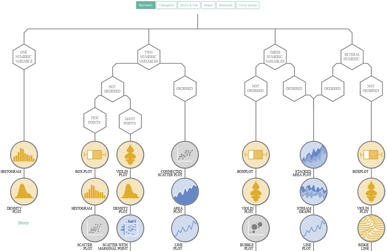
This decision tree guides users in selecting appropriate visualization methods based on their data characteristics. Each type leads to a set of visualization options.
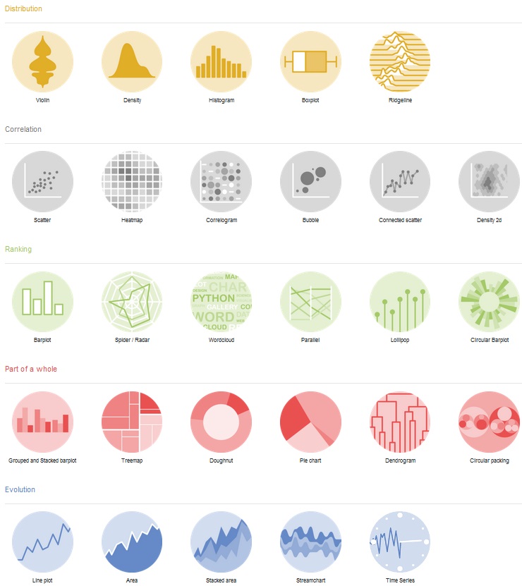
Find example R code
The R Graph Gallery showcases a diverse collection of charts and visualizations created using the R programming language. The gallery features hundreds of charts organized into various sections, each accompanied by its reproducible code for users to study and adapt. The focus of the gallery is on leveraging the tidyverse and ggplot2 packages for creating aesthetically pleasing and informative graphs.
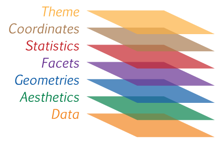
Your plots are layers
- Data: The actual variables to be plotted.
- Aesthetics: The scales onto which we will map our data.
- Geometries: Shapes used to represent our data.
- Facets: Rows and columns of sub-plots.
- Statistics: Statistical models & summaries.
- Coordinates: The plotting space we are using.
- Theme: Describes non-data ink.
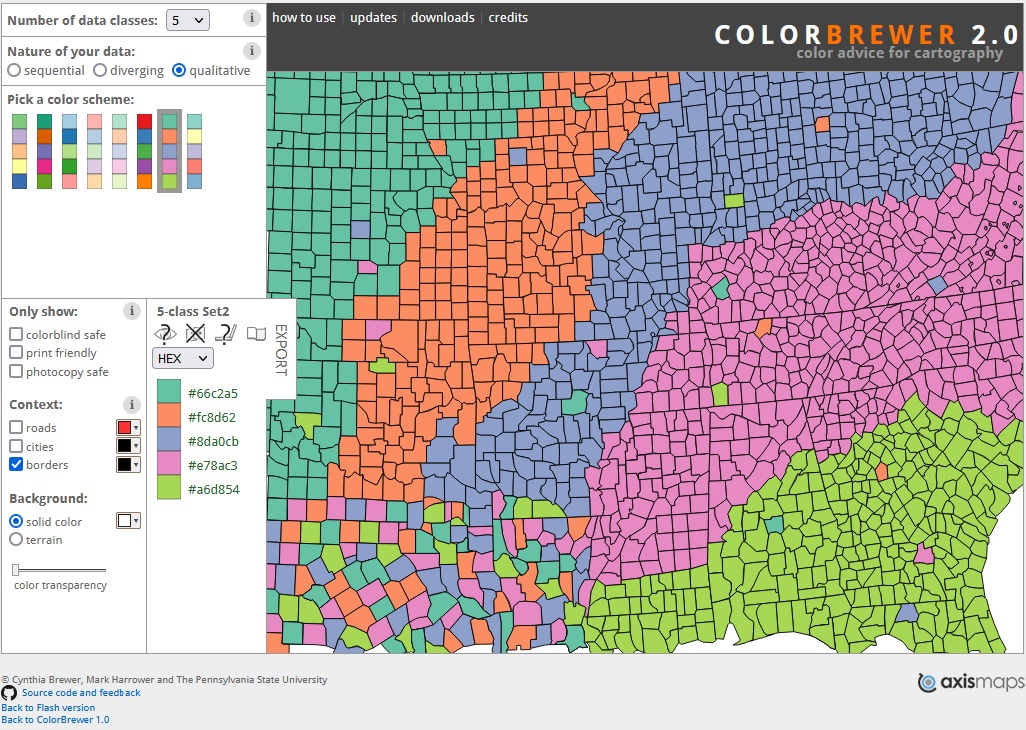
Youʼll also need colors
More Cheatsheets